Making A Single Plot#
This page focuses on creating a single plot, such as generating a scatter plot on a single axis.
Making a plot from Data#
Basic usage#
The general method for generating a plot is by using the plots() method, as demonstrated in the example below:
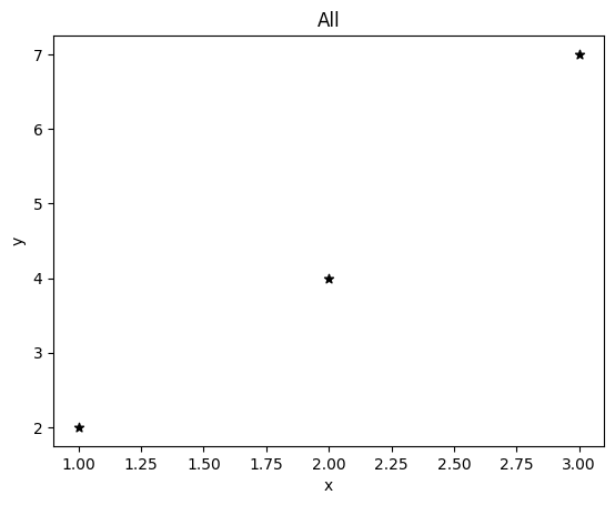
from pyttop.table import Data

data = Data(name='data')
data['x'] = [1, 2, 3]
data['y'] = [2, 4, 7]

data.plots(
    'scatter', # the plotting function used
    cols=('x', 'y'), # the columns used as inputs
    marker='*', color='black', # more options for the plotting function
    );
Where:
'scatter'specifies the type of plot, i.e., the name of the plotting function.colsspecifies the columns to be used as positinoal arguments for the plotting function;markerandcolorare additional arguments passed to the plotting function.
In this example, the effect is similar to:
import matplotlib.pyplot as plt
plt.scatter(data['x'], data['y'], marker='*', color='black')
However, the x- and y-axis labels are set automatically, and the title ‘All’ indicates that all data rows within the table are shown on the plot.
The column data can also be passed as keyword arguments:
data['m'] = [0, 3, 2]
data.plots(
    'scatter',
    cols=('x', 'y'),
    kwcols={'c': 'm'},
    marker='*',
    );
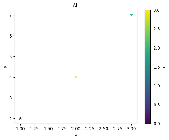
Which is similar to:
plt.scatter(data['x'], data['y'], c=data['m'], marker='*')
In PyTTOP, a colorbar and its label are also automatically generated.
As shown, the plots() method allows you to simply specify the column names to be plotted, and the corresponding column data will be automatically passed to the plotting function (e.g., scatter). The type of plot and the available arguments are defined by the plotting function itself. You can use any of the built-in plotting functions, as introduced here, or define your own plotting functions by following the instructions here.
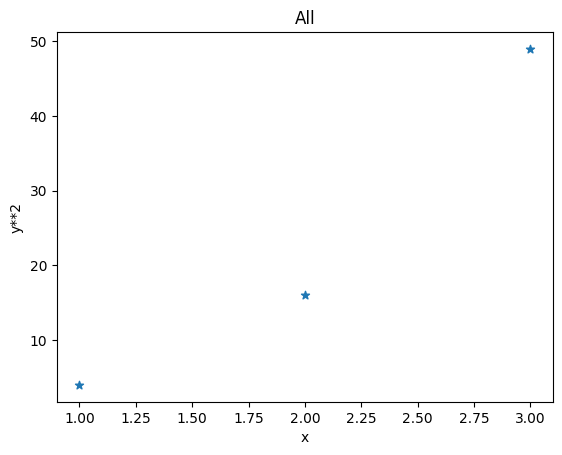
Enabling expression evaluation#
You can also provide expressions that can be evaluated by the eval() method (see the description here) instead of column names by setting eval=True:
data.plots(
    'scatter',
    cols=('x', 'y**2'), eval=True,
    marker='*',
    );
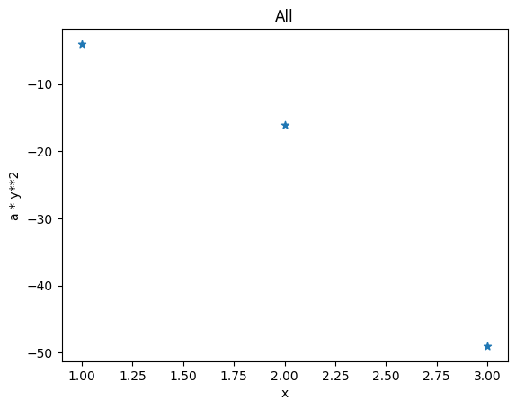
If you need to pass additional arguments to the eval() method, you can provide them via eval_kwargs:
data.plots(
    'scatter',
    cols=('x', 'a * y**2'),
    eval=True, eval_kwargs={'a': -1},
    marker='*',
    );
Built-in basic plotting functions#
In data.plots(), you can specify any of the built-in plotting functions by its name, such as 'hist'. However, if you would like to access the plotting function directly, you can import it from pyttop.plot:
from pyttop.plot import hist
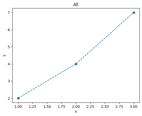
plot#
This is the plt.plot counterpart in PyTTOP, and the available arguments are similar to those of plt.plot.
data.plots(
    'plot',
    cols=('x', 'y'),
    linestyle='--', marker='o',
    );
scatter#
This is the plt.scatter counterpart in PyTTOP, and the available arguments are similar to those of plt.scatter.
data.plots(
    'scatter',
    cols=('x', 'y'),
    kwcols={'c': 'm'},
    s=[10, 30, 50],
    marker='o',
    );
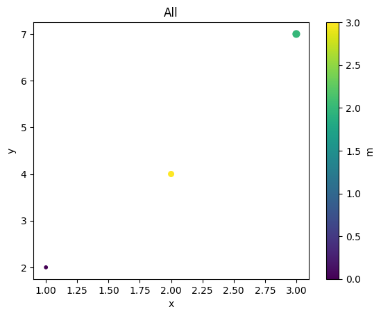
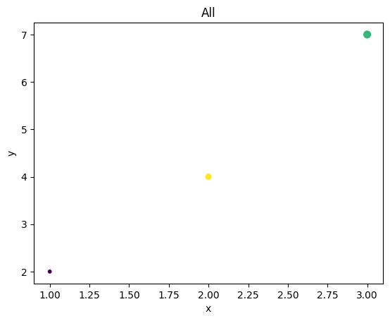
A colorbar is automatically generated by default. To suppress colorbar generation, set autobar=False:
data.plots(
    'scatter',
    cols=('x', 'y'),
    kwcols={'c': 'm'},
    s=[10, 30, 50],
    marker='o',
    autobar=False,
    );
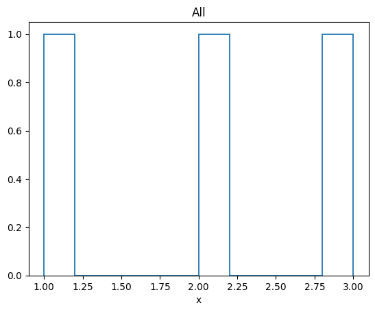
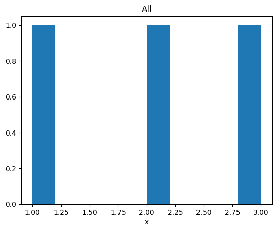
hist#
This is the plt.hist counterpart in PyTTOP, and the available arguments are similar to those of plt.hist.
data.plots(
    'hist',
    cols=('x'),
    );
hist2d#
This is the plt.hist2d counterpart in PyTTOP, and the available arguments are similar to those of plt.hist2d.
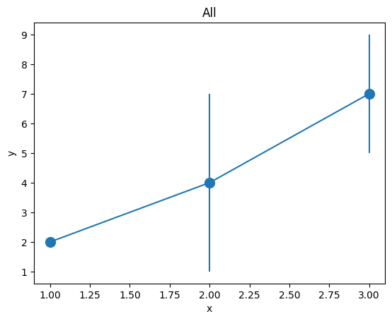
errorbar#
This is the plt.errorbar counterpart in PyTTOP, and the available arguments are similar to those of plt.errorbar.
data.plots(
    'errorbar',
    cols=('x', 'y'),
    kwcols={'yerr': 'm'},
    marker='o', markersize=10,
    );
Convenient plotting methods#
PyTTOP offers several convenient methods to further simplify the code for generating plots. The methods and examples are listed below. Note that the default plot settings may differ from those used with data.plots(<...>).
data.scatter()#
This method simplifies using data.plots('scatter', <...>). For example:
data.scatter('x', 'y', c='y*2', s='y*10', eval=True, marker='o');
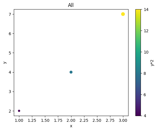
Note that if the value of the c argument appears as a color string (e.g., 'r' for red), it will be interpreted as a color rather than a column name.
data.hist()#
This method simplifies using data.plots('hist', <...>). For example:
data.hist('x');