Additional Plotting Functions#
PyTTOP provides basic plotting functions such as plot, scatter, hist, etc., which can be used standalone or passed to data.plots(). In addition to these, PyTTOP also offers some higher-level plotting functions designed for more specific use cases.
This page demonstrates typical usage patterns of these plotting functions through examples. For a complete list of supported arguments, refer to the API reference.
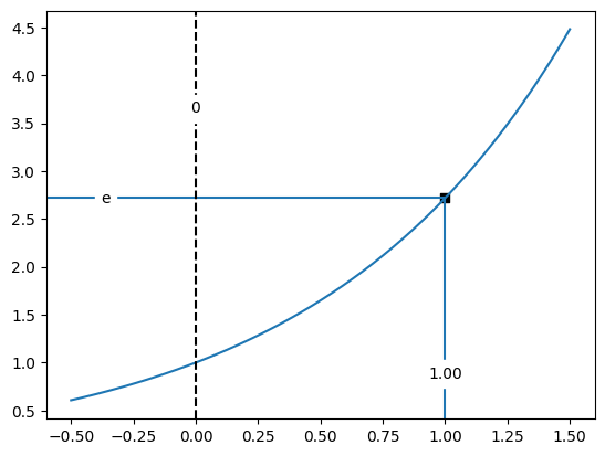
refline#
refline() plots horizontal and/or vertical reference lines to mark specified x and y values. Typical usage is shown in the examples below:
from pyttop.plot import refline
import numpy as np
import matplotlib.pyplot as plt

xs = np.linspace(-.5, 1.5, 100)
ys = np.exp(xs)
plt.plot(xs, ys)

# Annotate the point (1, e) on the curve
refline(x=1, y=np.e,
        ytxt='e', # custom label for the y value
        marker='s', style='axis',
        )

# Add a vertical line at x=0 with label positioned 75% up the y-axis
refline(x=0,
        ypos=.75, # vertical label position (fraction of axis height)
        xfmt='.0f', # format x label with no decimal
        linestyle='--', color='k',
        );
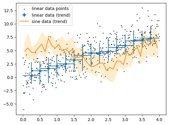
binned_quantiles#
binned_quantiles() visualizes the overall trend and scatter of the y-values within x-bins (sliding windows). Usage examples are shown below:
from pyttop.plot import binned_quantiles
import numpy as np

x = np.linspace(0, 4, 500)
y1 = 2*x + np.random.normal(scale=2, size=len(x))
y2 = 2 * np.sin(2 * x) + 4 + np.random.normal(scale=2, size=len(x))

binned_quantiles(x, y1,
                 s=1, c='k',
                 bin_size=0.5, bin_dist=0.25,
                 label='linear data points', elabel='linear data (trend)',
                 )

binned_quantiles(x, y2,
                 show_scatter=False, show_errorbars=False, show_bins=False,
                 emarker='', errkwargs={'linestyle': '-'},
                 show_fill=True, fc='orange',
                 elabel='sine data (trend)'
                 )
plt.legend();