Advanced Plot Control and Customization#
The data and subsets defined here will be used for demonstration on this page.
Setting labels for columns and subsets#
You can set the labels for columns using the set_labels() method so that they will be used for automatic label generation:
data.set_labels(x='My label for $x$')
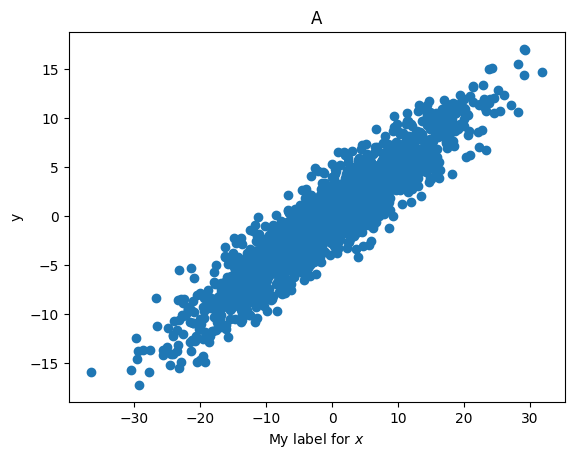
data.plots('scatter', cols=('x', 'y'), subsets=subset_A);
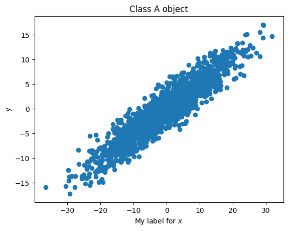
The labels of subsets can be specified during their definition, as described here. They can also be modified by directly changing the label property:
subset_A.label = 'Class A object'
data.plots('scatter', cols=('x', 'y'), subsets=subset_A);
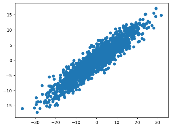
The automatic label generation can be turned off by setting autolabel=False:
data.plots('scatter', cols=('x', 'y'), subsets=subset_A, autolabel=False);
Note
The automatic generation of axis labels (e.g., x and y labels) covers typical scenarios and should work reliably in most cases. However, it might not be accurate in some rare situations. It is always advisable to review what you are plotting and manually adjust axis labels if needed.
Handling figures and axes#
By default, the plots() method returns the Matplotlib Figure and Axes, allowing you to make further adjustments, such as changing axis limits, labels, and more.
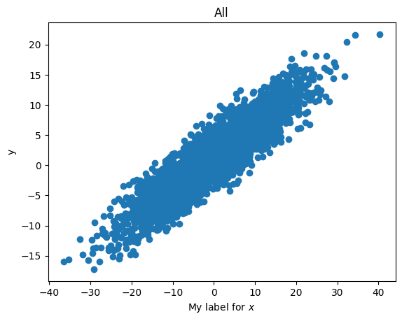
fig, ax = data.plots('scatter', cols=('x', 'y'))
fig, ax
(<Figure size 640x480 with 1 Axes>,
 <Axes: title={'center': 'All'}, xlabel='My label for $x$', ylabel='y'>)
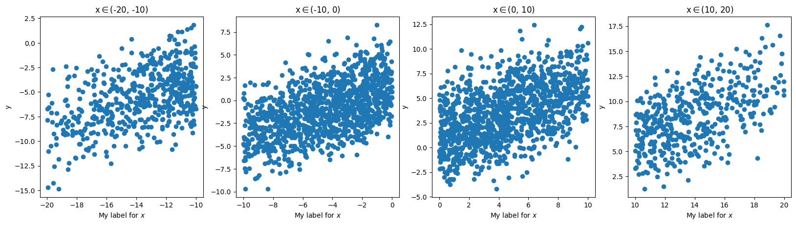
fig, axes = data.plots('scatter', cols=('x', 'y'), arraygroups='x_bins')
fig, axes
(<Figure size 1984x480 with 4 Axes>,
 array([<Axes: title={'center': 'x$\\in$(-20, -10)'}, xlabel='My label for $x$', ylabel='y'>,
        <Axes: title={'center': 'x$\\in$(-10, 0)'}, xlabel='My label for $x$', ylabel='y'>,
        <Axes: title={'center': 'x$\\in$(0, 10)'}, xlabel='My label for $x$', ylabel='y'>,
        <Axes: title={'center': 'x$\\in$(10, 20)'}, xlabel='My label for $x$', ylabel='y'>],
       dtype=object))
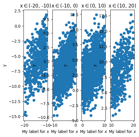
You can also pass Figure and/or Axes objects to the fig and axes arguments of plots(), specifying where the plot should be made. For example:
my_fig = plt.figure(figsize=(5, 5))
data.plots(
    'scatter', cols=('x', 'y'), arraygroups='x_bins',
    fig=my_fig);
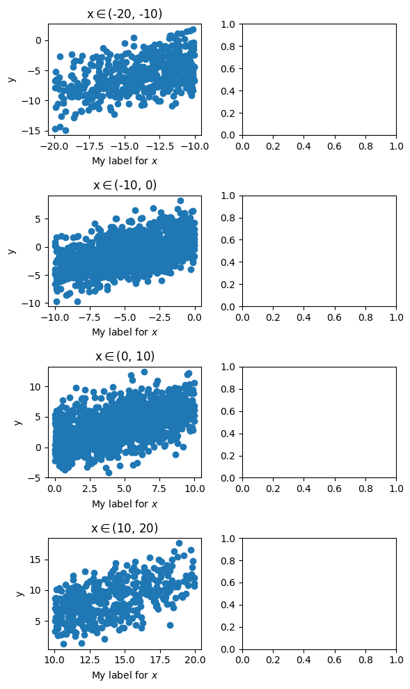
fig, axes = plt.subplots(4, 2, figsize=(6, 10))
left_panels = axes[:, 0]
data.plots(
    'scatter', cols=('x', 'y'), arraygroups='x_bins',
    axes=left_panels)
plt.tight_layout()
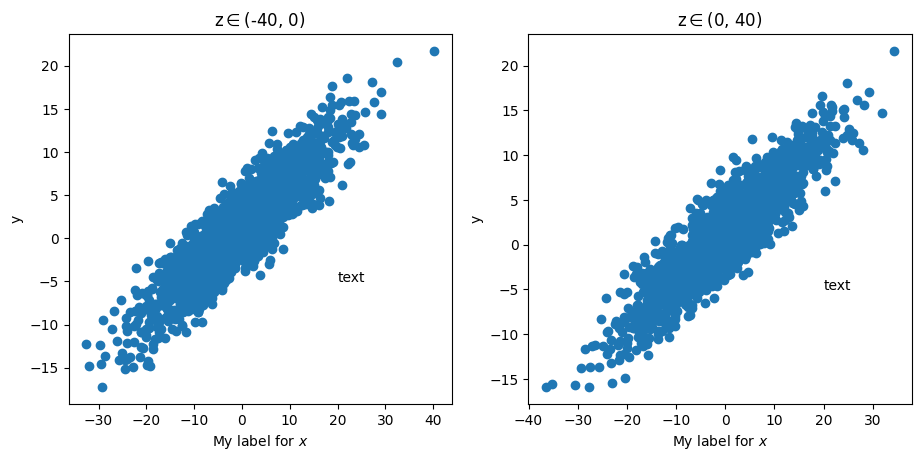
The axis callback#
The plots() method accepts a callback function that is executed after plotting on each axis. This can be useful if you need to make the same adjustments to every axis. For example:
def add_text(ax): # an axis callback function takes a Matplotlib axis as input
    ax.text(20, -5, 'text')

data.plots(
    'scatter', cols=('x', 'y'), arraygroups='z_bins',
    ax_callback=add_text
    );